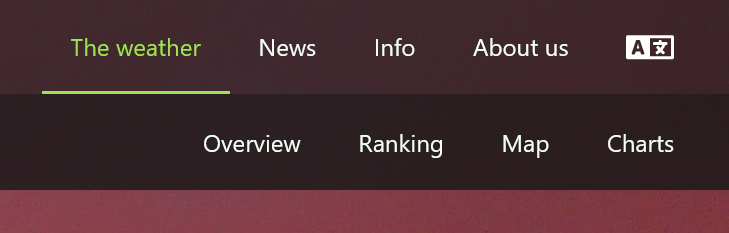
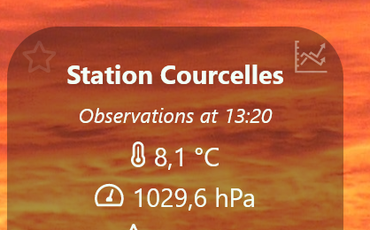
 | You can reach the charting page in two different ways: - via the menu “The weather”, submenu “Charts”. You will see a menu where you can choose the weather station and also the charting period. - or by clicking the charts icon in the upper right corner of the weather station panel. The chart will immediately display the station data using a default period of 24 hours. Of course you can select another period from the dropdown box. |
 | |
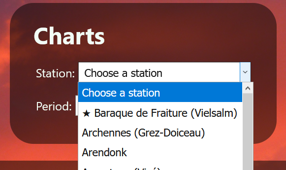 | When opening the station dropdown box, you will see all available stations sorted A-Z. Stations which are marked as ‘favorite’ in the overview page will appear on top of the list. |
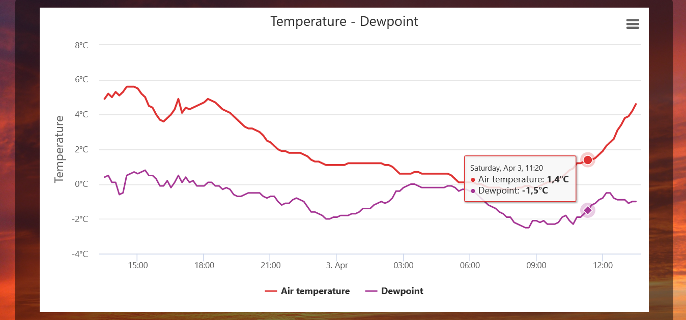
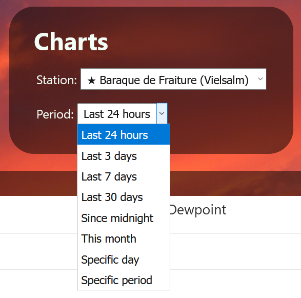 | Several timeframes are available by default. Please refer to the image on the left. When new data becomes available, the chart will be updated and the new data will be inserted at the right, except when you did select the “Specific day” or “Specific period” option and the specific day or end date of the specific period is not today. Avoid selecting longer periods than one month as much data has to be transferred and loading times will increase. Especially on slower networks this can be annoying. In the future more chart options will be implemented which will make it possible to view longer periods. |
 | All available parameters of the weather station are plotted on different charts: If the weather station location only has a MeteoHelix, wind charts are not shown; when there's no rain gauge connected to the MeteoHelix, the precipation chart is not available. |
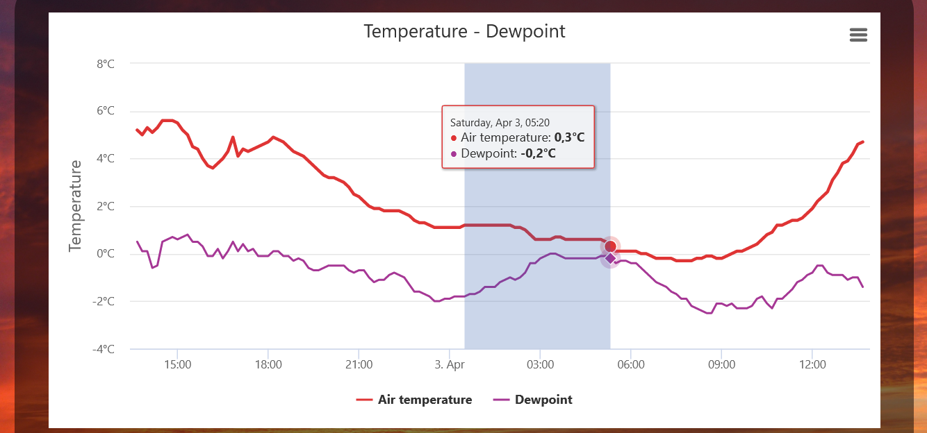 | Zooming in is possible by dragging the mouse over the interested period. Make sure you place your mouse pointer in the area where the chart is drawn. In the example on the left, this means between the time axis of the bottom and the line with 8°C (the blue shaded area). When releasing the mouse button, the selected region will expand. |
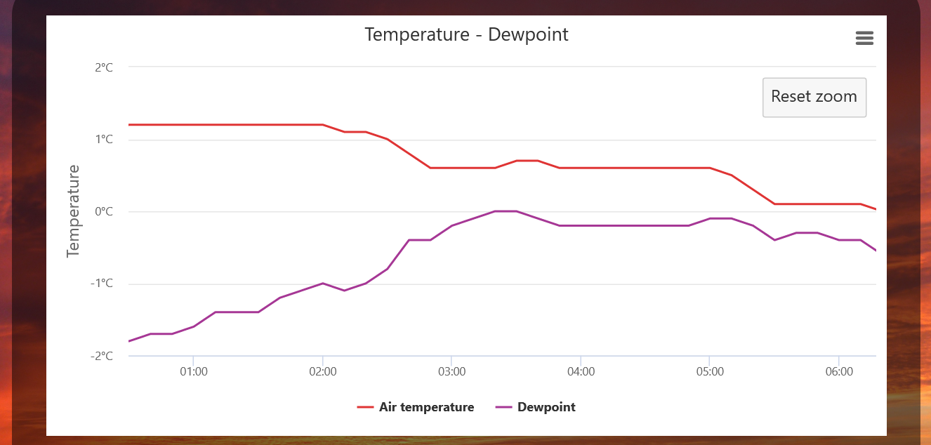 | After zooming in, in the upper right corner of the chart a button will appear. If you want to return to the original size, click on “Reset zoom” button. When zoomed in, you can pan the chart (move the chart to the left or the right) by moving the mouse in the charting area, holding down the SHIFT-key, press the left mousebutton and drag the mouse to the left or right.
|
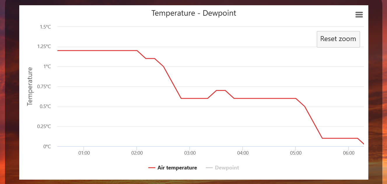 | On charts containing two or more data series, you can hide one or more series by clicking on the legend of the appropriate parameter at the bottom of the chart. The data series to hide will disappear and the corresponding legend will become grayed out. To unhide it, click again on the (grayed out) legend at the bottom. |
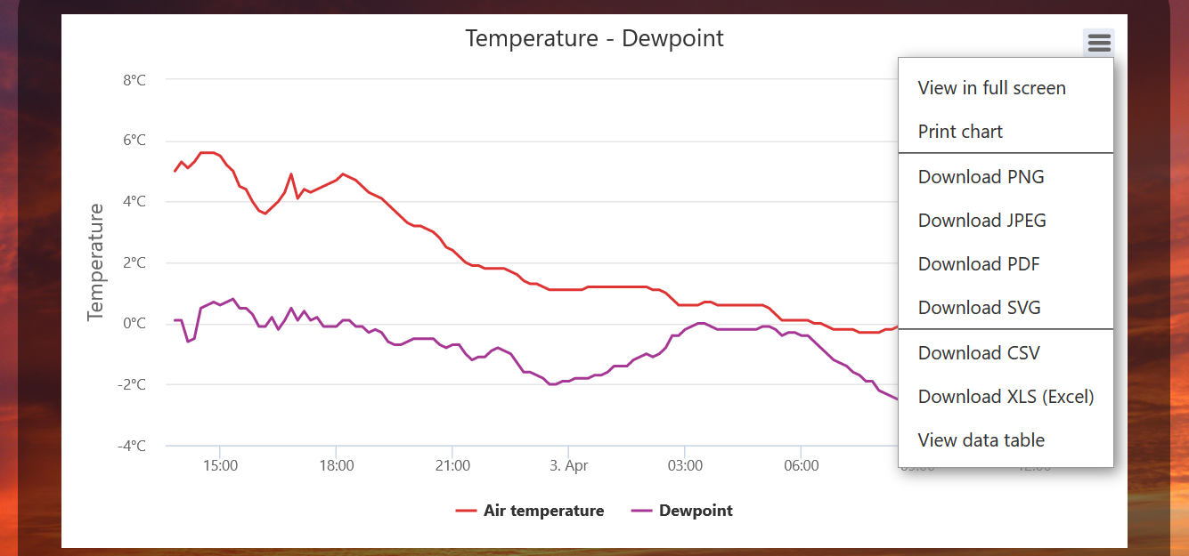 | Clicking on the three horizontal lines in the upper right corner of the chart opens a new menu where you can: - look at the chart in full screen. When in full screen mode, at the same location in this menu you can find the command to leave full screen mode. - print the chart on your printer - download the chart as image in either PNG or JPEG format - download the chart as a PDF document - download the chart as SVG vector image - download all the data in the chart as CSV file - download all the data in the chart as XLS file (for use in Microsoft Excel) - view the data table; it will appear directly under the chart. Keep in mind that charts with data series for several days have very long tables! |